Posts Tagged ‘creative staging ideas’
I have worked with these homeowners on a number of fronts. We staged their previous home and it was under contract within 15 days! They have since moved into a new home where they remodeled the entire first floor. Check out the before and after photos below! They have began to settle into their new home; therefore, the staging has commenced. Staging is not just for preparing a home for sale but can also be utilized to shape a room for life! We are trying to utilize the majority of what they own and add a few new accessories. This house has been a work in progress but we wanted to share the most recent photos! Please post a comment and let us know your thoughts!
BEFORE
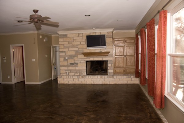
The home had chocolate brown concrete floors and the fireplace unit was a bit awkward. The homeowners wanted a much more warm and inviting feeling which we definitely accomplished!
AFTER
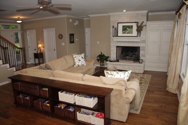
We made some major improvements. We chose a beautiful maple, wide planked floor. It automatically changed the feeling of the room. We had the T.V. unit refinished to match the kitchen cabinets. The T.V. unit now flows very nicely with the white molding. We went with a soft white cabinet color and finished them out with a soft chocolate colored glaze. We had it glazed just enough to hang up in the cracks but not to much. Be careful when glazing cabinet doors, too much glaze can make them extremely busy. The entire first floor was also repainted a soft and inviting neutral.
In regards to staging, the homeowner wanted to go with a “Nest” theme. It is such a great feeling to nestle into a new home. The bird pillows on the couch were purchased from Pottery Barn and we continued this theme into the dining room as well. Otherwise, we have tried to utilize the furniture they previously owned. It is a great place for children to play and a wonderful place to entertain. We purchased new white baskets to organize the kids toys, look at the difference in the white baskets vs. the darker baskets. The white baskets are such a lighter, airier look.
BEFORE
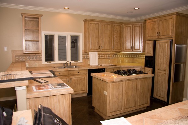
This is a beautiful kitchen, no question, but it wasn’t the owner’s taste! The homeowners wanted a much more airy and fresh feeling kitchen. The cabinets in this photo are a crackle paint that made the kitchen look and feel a bit dated. The combination of the back splash, counters and cabinets gave the kitchen an overall orange tone. The homeowners wanted to get away from orange and bring in more neutral tones. The appliances were also outdated. Notice the island and the placement of the stove (all of this was modified, see below). Also notice the sink in the before photo…check it out in the after photo! You can never have a big enough sink!
AFTER
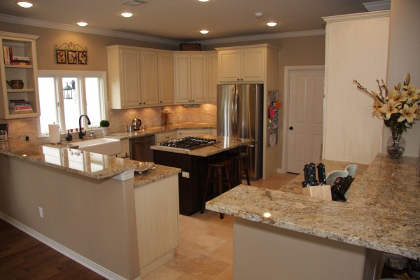
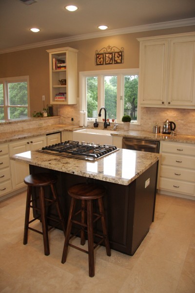
This kitchen went from drab and dated to fabulous and updated! The kitchen is now airy and fresh feeling. We moved away from orange and moved towards yellows and taupe’s. We purchase granite for the counters and a rock like backsplash. When choosing granite it is extremely important to make sure it pulls the overall tone you are looking for. In this case we wanted a golden color and we got just that! All the appliacnes were updated to LG Stainless Steel. We purchased them at Aus Tex appliances, a place I would highly suggest checking out if you need new appliances. We installed travertine floors which are much more resistant to children and messes than hardwood. You have to be extremely careful with wood in regards to spills. Travertine is much more durable in the kitchen, especially if you have children. The owners installed under the cabinet lighting and notice how it lights up the backsplash. We also provided some contrast in the kitchen by making the island stand out from the outer cabinets. A dark brown was chosen and the island was extended to provide a small bar. If you need help or suggestions with your remodeling project contact Austin Simple Staging your premier Austin Home Staging Company! (512) 585-9550
BEFORE
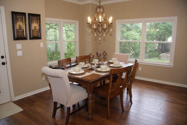
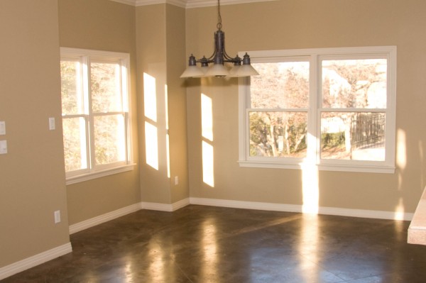
One person’s or families taste is simply not another’s! Check out the before photo and notice the difference of the new lighting fixture!
AFTER
The home owners picked out this gorgeous chandelier and what a difference it makes. This room now has such elegance and class. The table was purchased from Pottery Barn and the place settings from World Market. To break up a wood table and chair set, purchase two accent chairs and place one at each end of the table. It gives a space a ton of character! Don’t worry about it matching perfectly, variety is good! This room really needs a rug under the table but often times practically rules! With children and messy eaters, it just isn’t possible! Either way this room is stunning and looks ready for a party!

